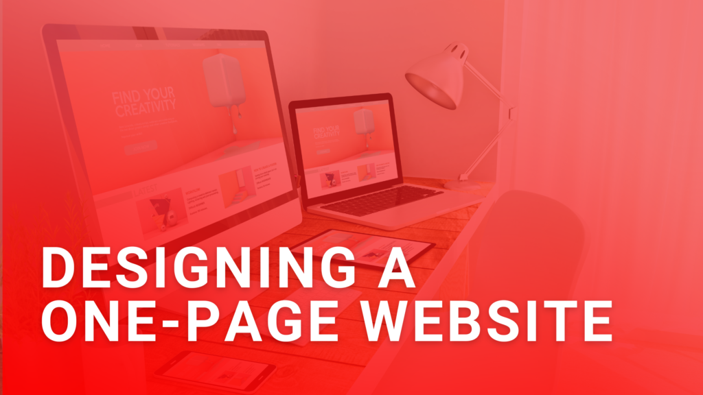
A one-page website is a great solution to delivering your message in a clear, concise manner. With only one page to design, it can be cost-effective for business owners with fewer resources to put towards a larger, more complex website. In this article, we will explore choosing a color scheme for your website, SEO, and ensuring mobile-friendliness!
When One-Page Websites Are Useful
One-page websites are useful for businesses that only need to display little information on their site. They can also be helpful when a business doesn’t have enough time or resources to create a complex website. One-page websites are also beneficial to non-e-commerce businesses and those who may need a portfolio, such as an artist or a photographer.
Choosing Your Website’s Color Scheme
Choosing your website’s color scheme is important because it’s the first thing people see when visiting your site! Ensure the colors you pick are accurate to your brand’s colors so it’s brand-accurate. Also, make sure that the color combos aren’t too busy. If customers see neon greens and bright pinks, it could turn them away instantly! Easy-to-read websites can lower bounce rates, so make sure your colors don’t clash with font colors or other pictures on your site.
SEO
Search Engine Optimization, or SEO, is the process of optimizing your website to rank higher in search engine results. When designing your website, you should keep in mind a few things to help your website’s SEO, such as inserting relevant keywords into your copy, getting the site to load/run faster, and even ensuring your website is mobile-friendly. When researching keywords to insert onto your one-page website, it’s important to remember not to keyword stuff. Keyword stuffing is when there are too many keywords “stuffed” into content, which can make Google penalize you and make readers confused. Choose a few that works best for your brand and scatter them throughout.
Ensuring Your Website is Mobile-Friendly
The best part about having a one-page website is that you only have one page to design! This means creating a mobile-friendly version of your site can be easier. A mobile-friendly website is designed to work well with mobile devices, such as smartphones and tablets. Since phone screens are already so small, one method of doing this is to make fonts larger and easier to read on mobile devices. Buttons should also be altered for mobile devices, so adjust their sizes accordingly. Not only do mobile-friendly web designs work well for users, but they can also be helpful for SEO purposes! Google will rank a page higher if it has a mobile-friendly version.
If you found this article to be helpful, check out our blog “How to Know if You Need a One-Page or Multipage Website“