Social media is the number one way for businesses to connect with their customers in 2022. Having a strong social media presence is key to building a community, establishing credibility, and showcasing what your business is all about.
We want to teach you some tips when it comes to creating social media graphics, so let’s get into it.
Buckle Down Your Branding
Branding is one of the biggest things you need when it comes to making cohesive content. Here are things to consider when creating a brand kit for your business:
What colors represent your brand? We recommend using no more than 4 different colors. You should at least have 1 bold color and 1 complementary color.
What text fonts are you using? A brand should have a total of 2 to 3 different fonts. There should at least be 1 big design font, 1 font for headers, and 1 font for body text.
What imagery are you using? Imagery is not the same thing as your logo, it’s the photos and stock images you want to use for graphics. Brand imagery helps people recognize your business, whether that be online, in person, or from a marketing campaign.
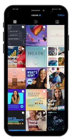
Take a look at Canva’s Instagram page. They have great graphic examples that you can get inspiration from and use for your own designs.
Use High Quality Images For Your Social Media Graphics
You need to be using high quality photos as much as possible. Viewers are more likely to interact with posts that have high resolution photos. 📷 If you’re not the best photographer, you might want to consider hiring out a photographer.
Create Templates
Templates are the easiest way to create an aesthetically pleasing feed, and makes creating new content much quicker. Once you create a template all you have to do is plug in a new photo and text and boom you’re done!
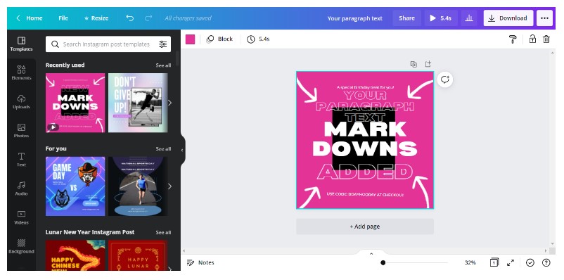
There are several free and paid platforms out there for designing graphics. Here’s a few you can look at:
Understand Design Basics
Understanding design basics is crucial to creating great graphics. You need to pay attention to what platforms you’re posting to. One size does not fit all when it comes to posting on social media, but we have the best sizes listed below just for you.
Best Photo Sizes for Social Media Feeds
Instagram: 1080 x 1080 (square) or 1080 x 1350 pixels (portrait)
Facebook: 1200 x 630 pixels
Linked-In: 1200 x 1200 (square) or 1080 x 1350 (portrait)
Once you’ve chosen your layout size, here’s something to keep in mind before you start designing. Try keeping your text and elements closer to the center of the image. Here’s an example:
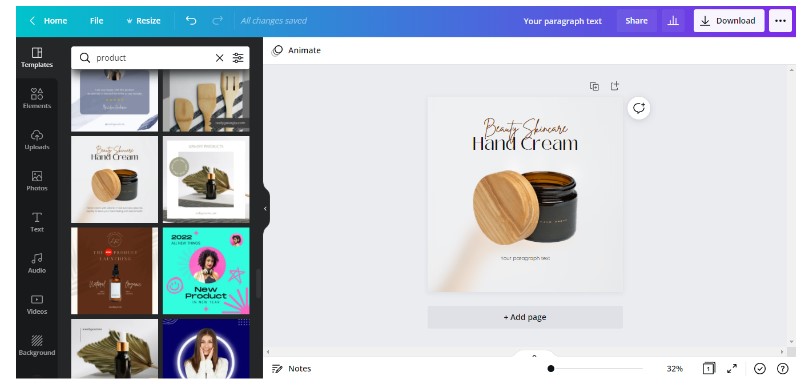
Sometimes designs can look a little chaotic, so using this method will help you avoid that most of the time. No one likes looking at a photo with too much going on. Keep it simple.
Create A Content Schedule
The last thing we recommend is creating a content schedule or calendar. This allows you to schedule your content ahead of time and visually see what content you need more or less of.
We made an example of a content schedule so you can really understand what we’re talking about.
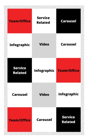
Making a schedule like this will make your life much easier, or at least more organized.
For more Social Media Tips, take a look at Which Social Media Platforms Are Right For My Business.
